Page 16 - JaKita 07th Edition 2021
P. 16

+J                                            The inspiration for+J
           16     LAPORAN UTAMA

                                                                                                                                      Simple yet bold, +J is the                    The combination of “+” and
      Getting to Know                                                                                                                 simplified version of the                      “J” will form a shape which
                                                                                                                                      main logo. It looks elegant,
                                                                                                                                                                                    resembles the sparks of
                                                                                                                                      simple yet iconic. Each of
                                                                                                                                                                                    fireworks often seen at
                                                                                                                                      the elements are able to be                   Monument National area.
                                                                                                                                      interpreted as pattern.
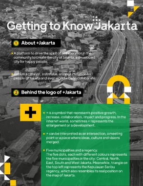
             1    About +Jakarta


            A platform to drive the spirit of collaboration in the                                                             3    The story behind colours of +J
            community to create the city of Jakarta, a developed
            city for happy people.


            Acts as a catalyst, a stimulus, an open invitation for                                                                    Central                                                South
            people of Jakarta and even worldwide to collaborate.

                                                                                                                             The orange colour of city buses                       Green is the colour of Betawi. It depicts
                                                                                                                             represents hard work, passion                         the people of Betawi who can live in
             2    Behind the logo of +Jakarta                                                                                and spirit to keep achieving                          harmony with other entities.

                                                                                                                             dreams.


                                       + is a symbol that represents positive growth,                                                   North                                                 West
                                       increase, collaboration, impact and progress. In the
                                       internet world, sometimes + represents the                                            Colour of Biru Abang represents the                   The yellow of gigi balang often
                                       enlargement or a development.                                                         movement of people in Jakarta, who                    seen alongside Betawi green.

                                                                                                                             live side by side and are connected to                This colour means warmth,
                                       + can be interpreted as an intersection, a meeting                                    each other. They blend in interactions                cleverness, and skilled in
                                       point or a place where ideas, culture and visions                                     and conflicts, and move throughout                     business.
                                       merged.                                                                               the city.


                                       Five municipalities and a regency.
                                       The five dots, each with different colours represents
                                       the five municipalities in the city: Central, North,                                                East                                               Kepulauan
                                                                                                                                                                                             Seribu
                                       East, South and West Jakarta. Meanwhile, triangle on
                                       the top left represents the Kepulauan Seribu                                          Pink none colour is often used for the                Biru pesisir (coastal blue) colour
                                       regency, which also resembles its real position on                                    clothes at Abang None Jakarta event,                  portrays the other side of Jakarta,
                                       the map of Jakarta.                                                                   which represents colourful and bold                   coming from the existence of
                                                                                                                             spirits of Jakartans.                                 Kepulauan Seribu regency.
                         7th EDITION 2021
         Sarana Informasi Pemerintah Provinsi DKI Jakarta
   11   12   13   14   15   16   17   18   19   20   21